
Forsite Euro Max
[ Package Design | Creative Direction | Product Launch ]
Elevating incontinence
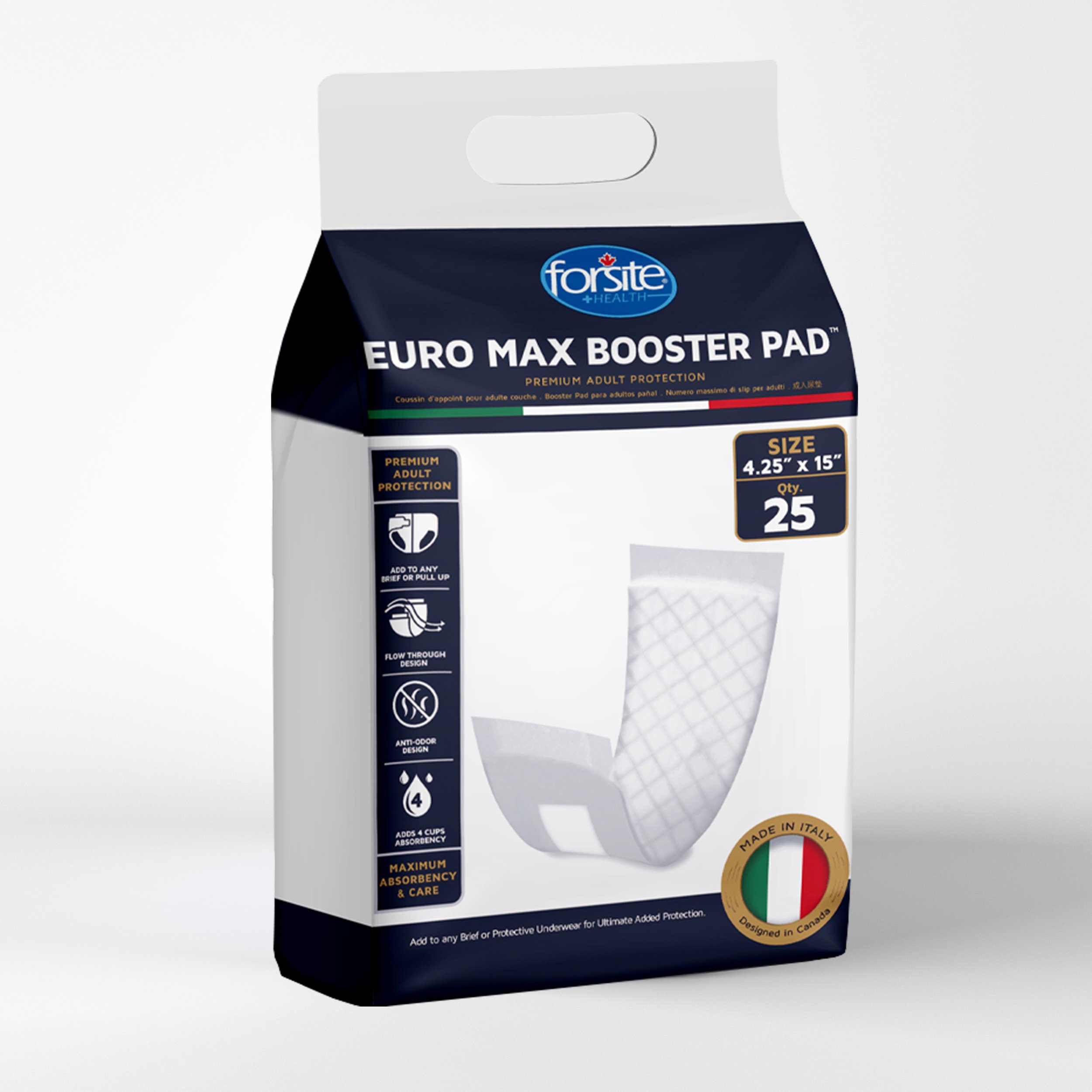
Forsite Euro Max, a step in the right direction for adult incontinence products!
While doing my market research with other competitors and even Forsite itself, I felt that many incontinence brands gave off a childish and youthful tone. I wanted this brand to elevate against the other competitors! I wanted people who use these products to feel like there was a brand that made this experience elegant and classy for them.
Which drove the whole pitch of premium quality adult product made no where else but Italy, to help our brands tone.
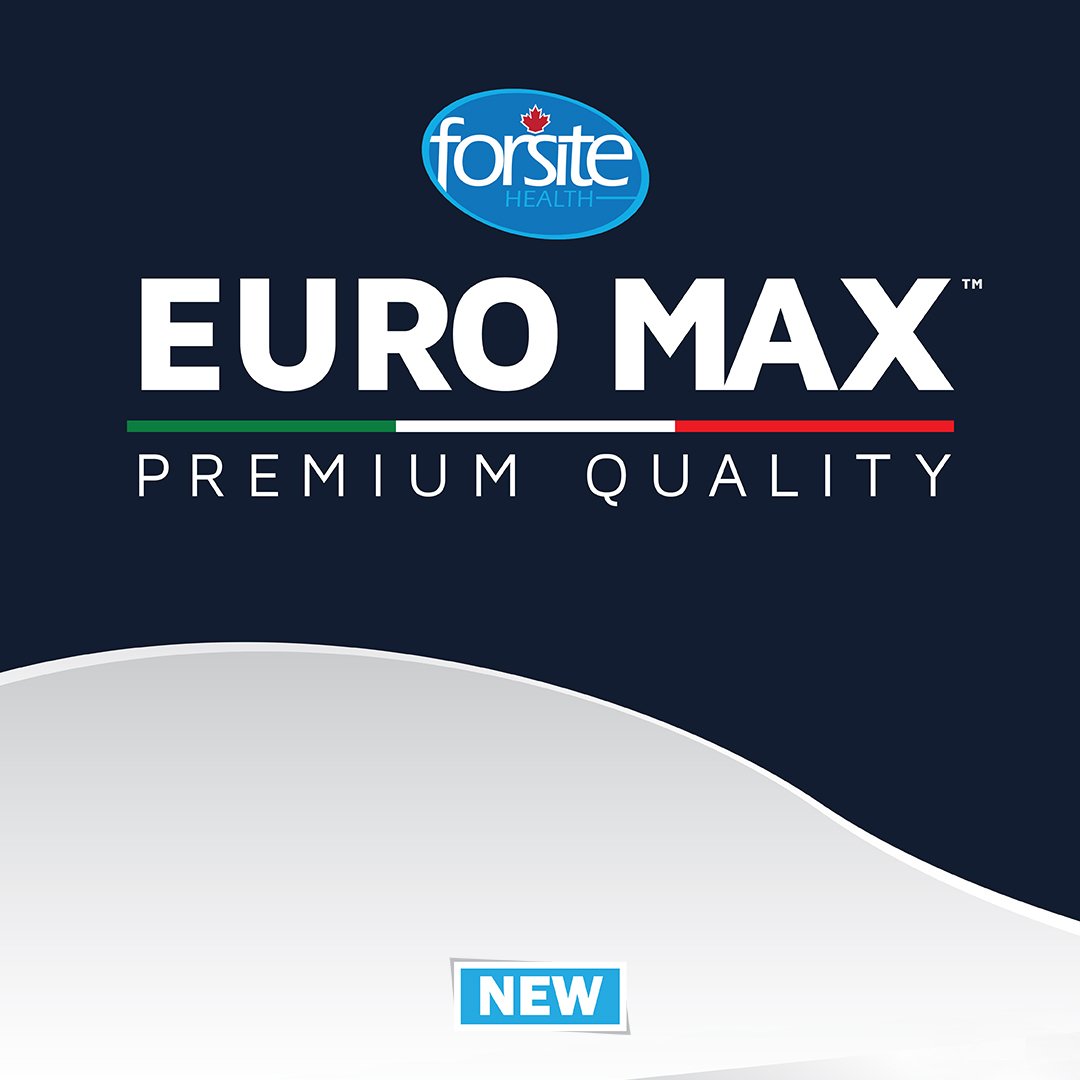
Branding


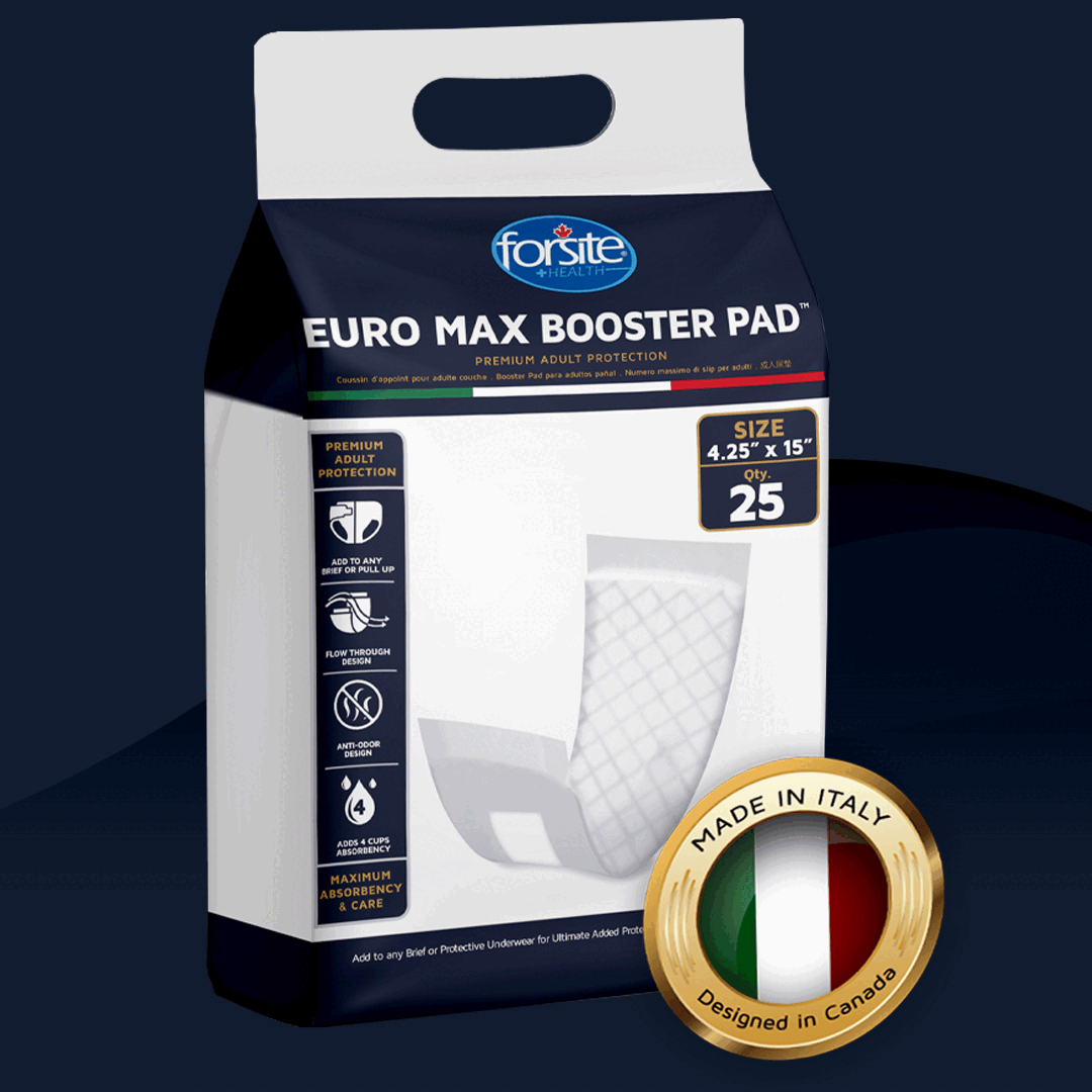
Package Design
Extra


The brand colours and tone allowed this packaging to feel very luxurious compared to our competition. When doing my research a lot of luxurious brands use the colour navy to give the impression of a premium quality product; as well as, when choosing my secondary colour the only other colour that could match this tone was, gold.
Website Photography


To tie in everything together from branding, packaging to now digital. I wanted to make sure our web photography would continue to hold up the standard I was trying to sell. My designs continued the excitement of this new luxurious brand on the market and help our sale with the product launch.

Email Blast

Social Media Content


This was my first time seeing the packaging in the flesh! So happy with my work and how it turned out.